Logo Re-Design for World Tour Audio


Client Profile
World Tour Audio is a music events service which arranges tours for artists, whilst also providing equipment and production. Working behind the scenes, World Tour Audio aims to bring people, within the industry, together to create a good show.
The Problem

The logo must be catered to people within the industry and behind the scenes, not the audience at the shows, therefore the logo must be subtle but stand out against competitors, it must not stand out to the general public
Isn’t cohesive
The logo can’t be used on a variety of platforms and applications
Can’t be used long-term
Re-design the logo for longevity and to look more cohesive

Our Solution


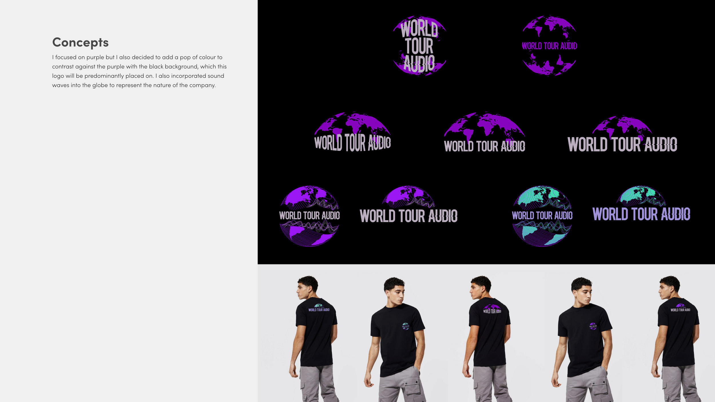
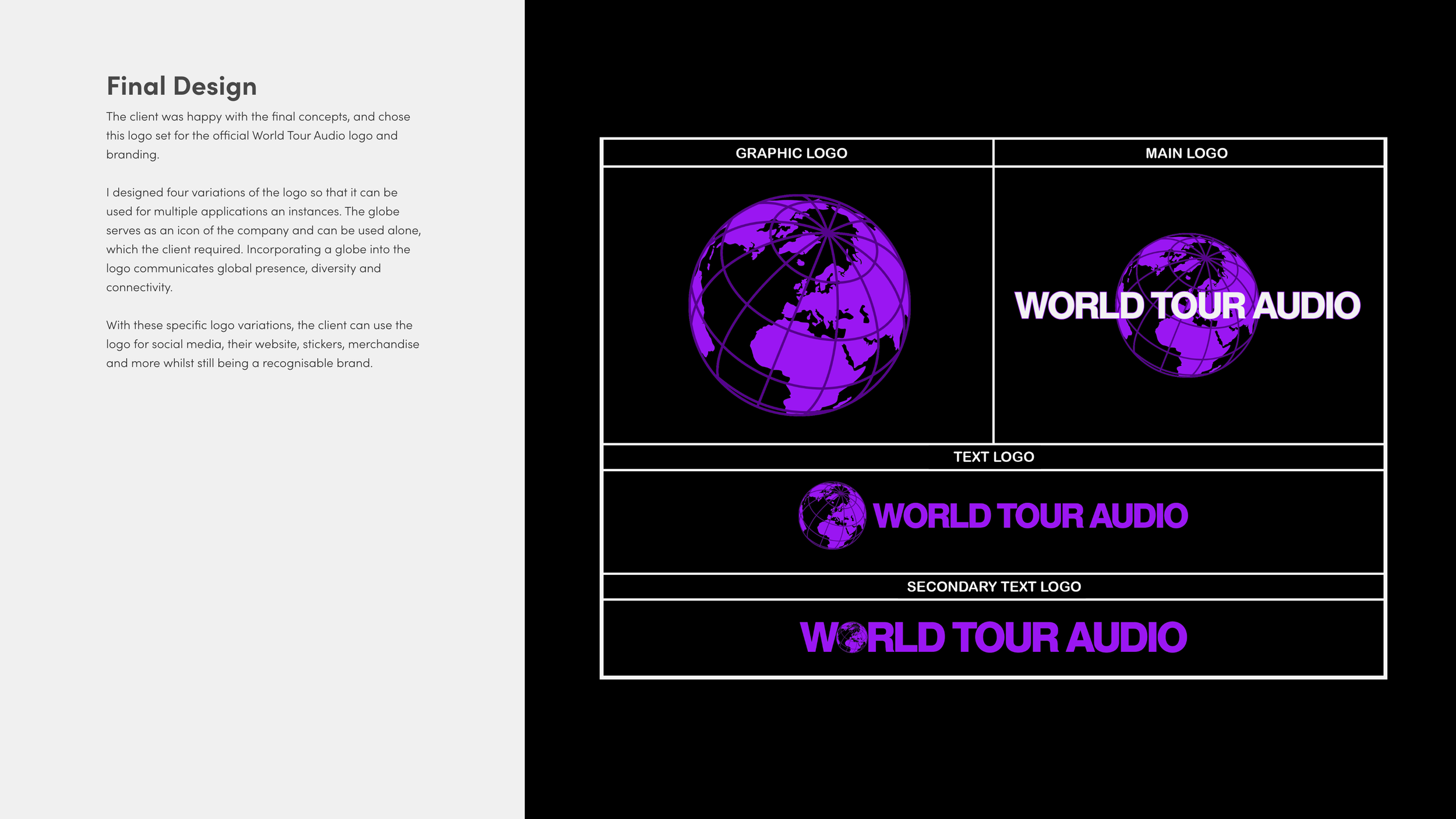
Design the logo suitable for various applications and include logo variations
The client mentioned how the idea behind the original globe logo was to make it look like a microphone, with the latitude and longitude lines looking like a microphone grille. With this in mind, we designed the globe at an angle which microphones are often held.
Re-design the logo for longevity and to look more cohesive
Gave the ability to use pieces of the logo separately

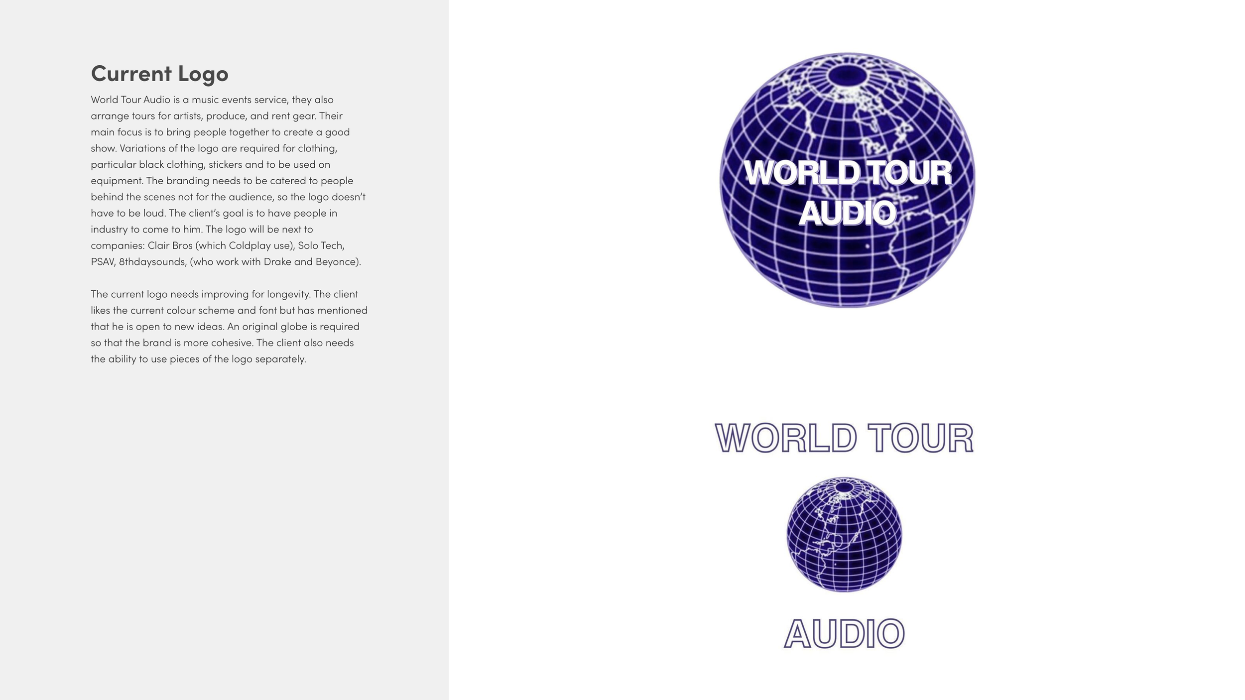
PREVIOUS LOGO


NEW LOGO SET
In order to stand out against competitors, not only did we create a unique globe, we also kept the purple colour scheme - only a little brighter and eye-catching against black tour equipment.

The Process

The client mentioned how the idea behind the original globe logo was to make it look like a microphone, with the latitude and longitude lines looking like a microphone grille. With this in mind, we designed the globe at an angle which microphones are often held.


The Results
Gained more attention from their desired target audience
Stood out back stage amongst the black equipment and greyscale logos

“Working with Chloe was such a breeze. Chloe went above and beyond on her presentation and was able to adapt to the environment of our business. She had many options for my team to choose from and worked incredibly fast. I can’t wait to work with her again on many more design projects.”
— J’velle, Tour Engineer of World Tour Audio
Let’s do great things together.
Ready to get started? Let’s start with a discovery call to ensure we meet your needs.

