Logo and Packaging Design for Rice Paper
Logo and Visually Appealing Packaging

Client Profile
Rice Paper is a concept Vietnamese Takeout aimed at the younger generation and families. This small company prides themselves on being a Vietnamese family run business, cooking traditional Vietnamese meals from scratch to be delivered or collected fresh. Rice Paper wants to stand out from local competitors and attract younger audiences to try a new cuisine.
Our Approach


We kept to a clean and minimalist style but also added the smiling mouth with the tongue out to bring a fun element to the brand. In relation to the nature of the business, this fun element connotes yummy food; which is intriguing and exciting to new and existing customers.
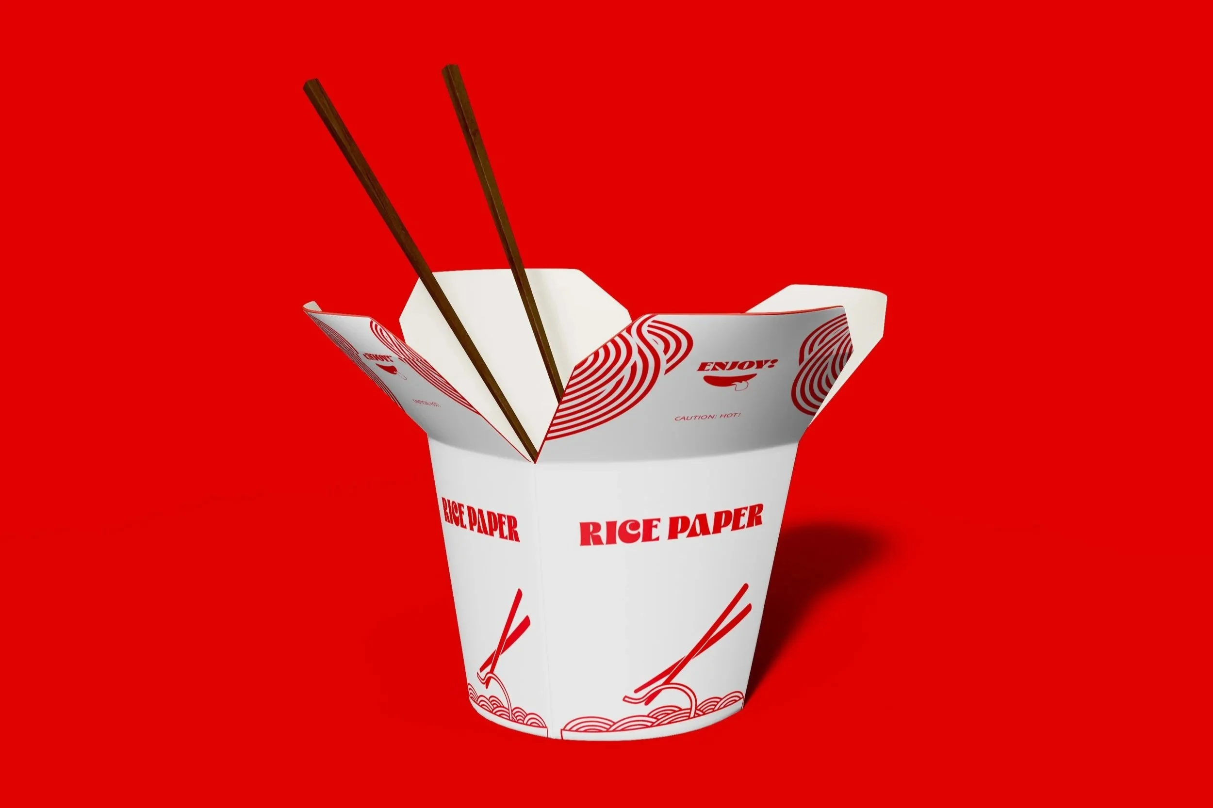
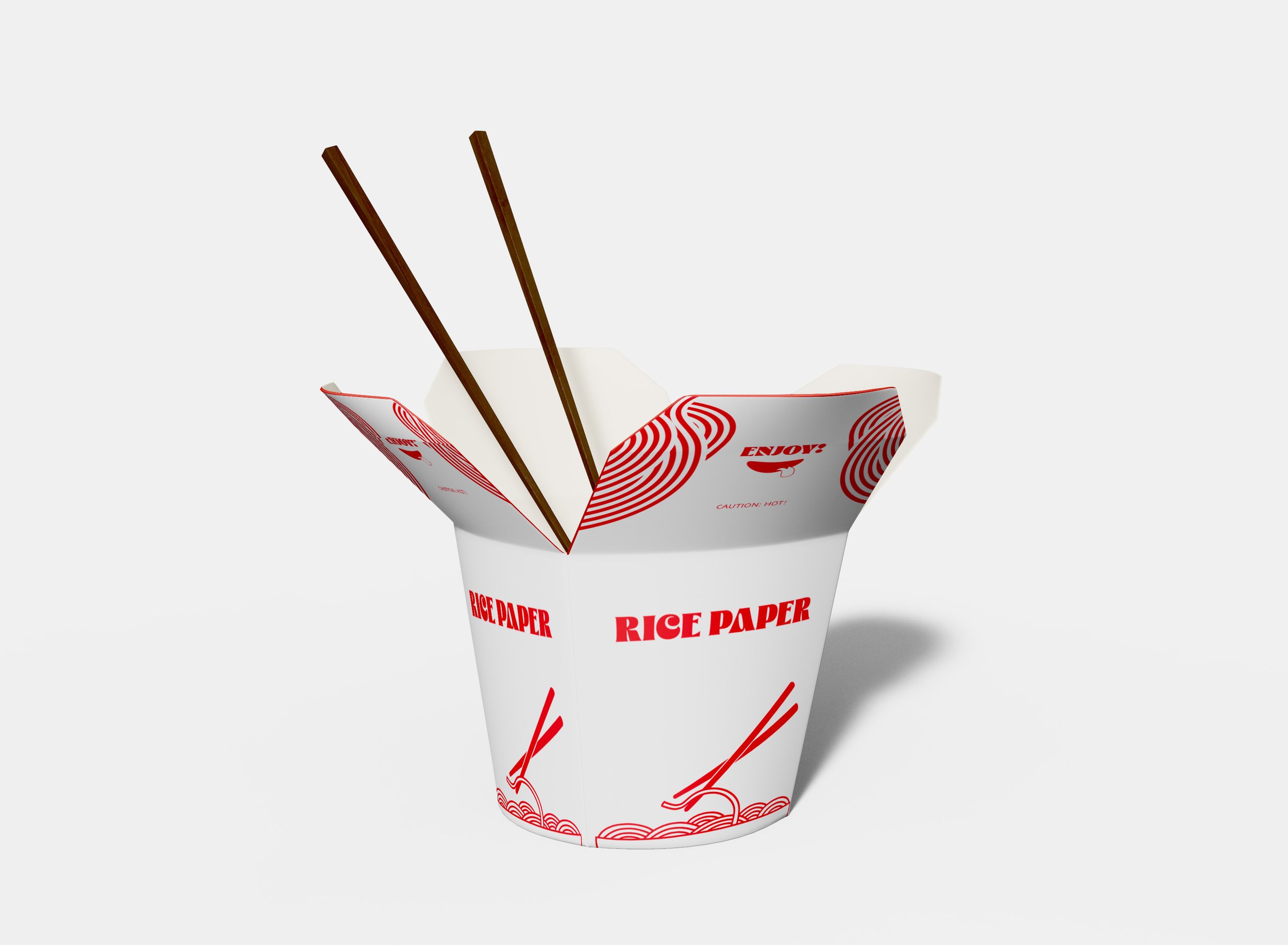
We kept to a simple colour palette of red, as it’s the main colour of the Vietnam flag, and white as red and white together represents fast food.
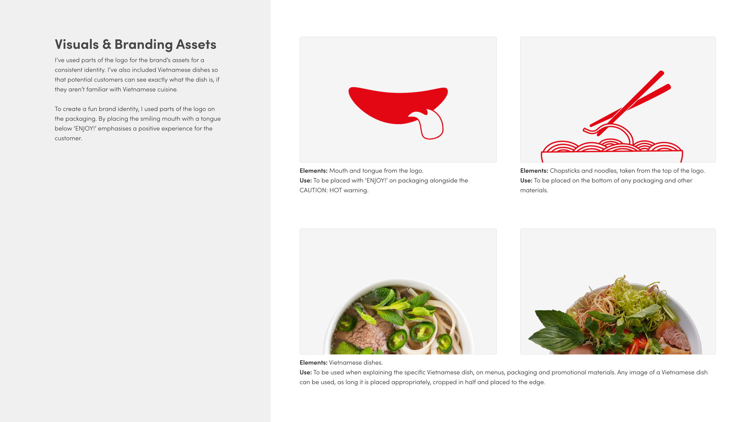
To keep the logo simple, we focused on including a bowl and noodles. We also decided to incorporate chop sticks as these are a long tradition in Vietnamese culture.
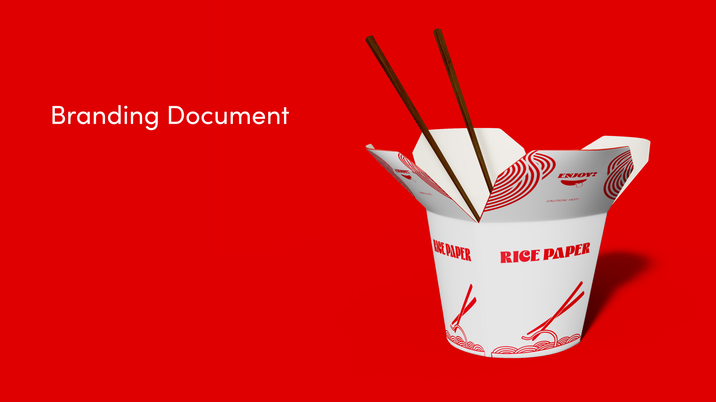
To create a fun brand identity, we used parts of the logo on the packaging. By placing the smiling mouth with a tongue below ‘ENJOY!’ emphasises a positive experience for the customer.
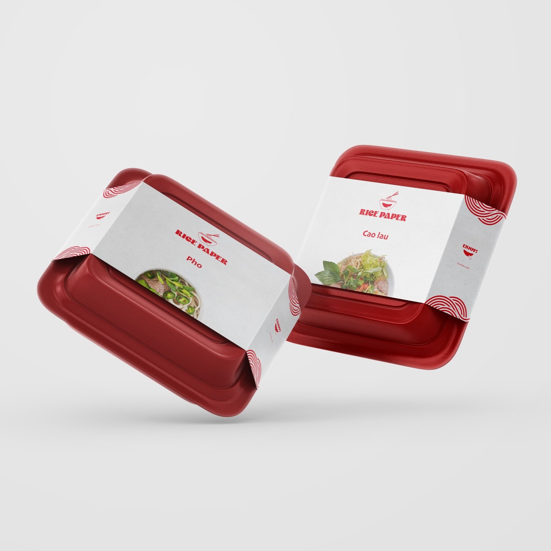
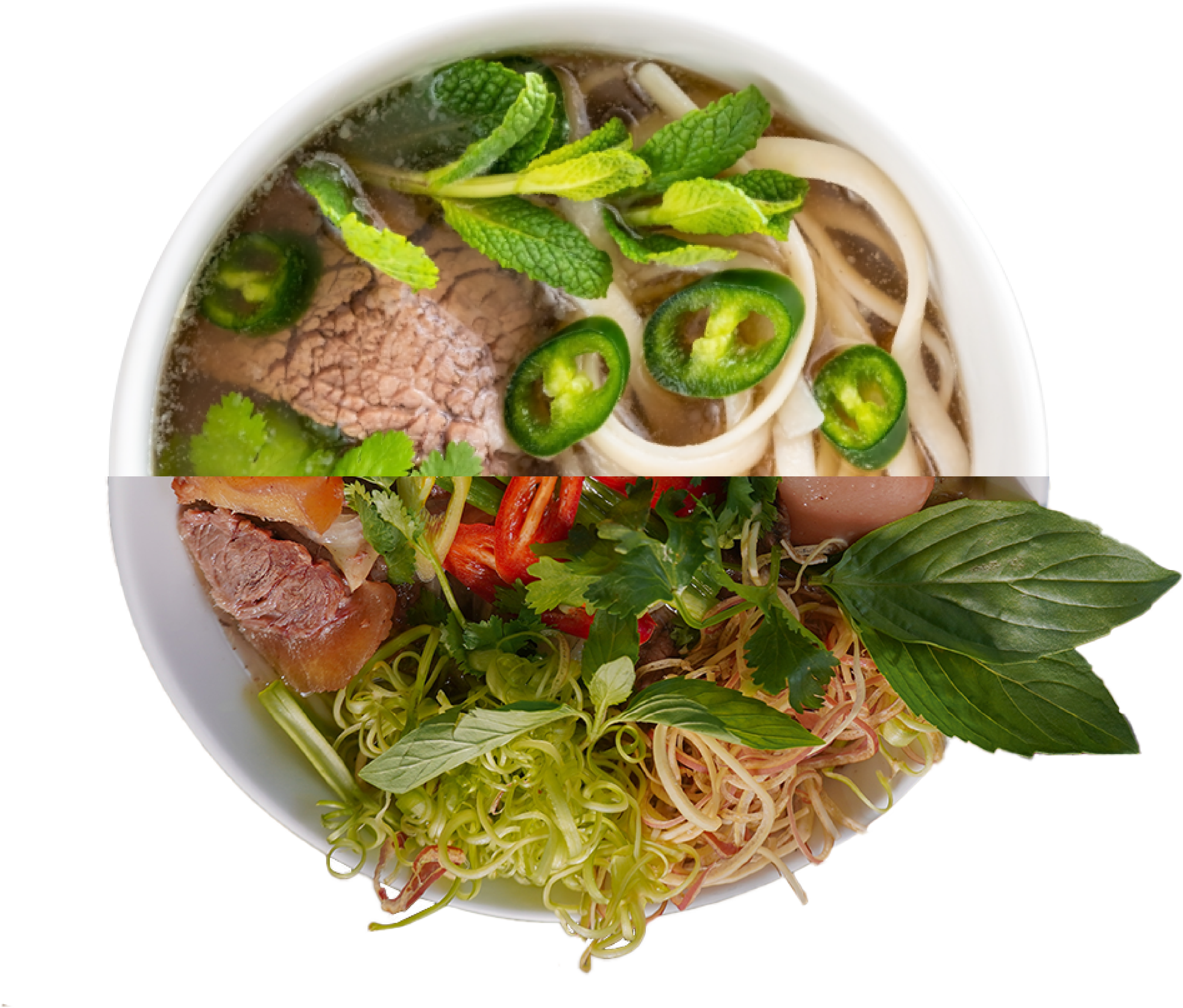
Keeping the branding fun, simple and suited to the wide age range of the audience, we also designed box sleeves for specific dishes. We placed an image of the individual dish below the name of the dish to excite the customer about the food they’re about to eat.
As the purpose of this packaging is to communicate the dish, a caution and ‘ENJOY!’ we kept the design clean and simple so that these mains aspects are communicated to the audience quickly and clearly


Visual Identity


Let’s do great things together.
Ready to get started? Let’s start with a discovery call to ensure we meet your needs.